Tabs
Tabs offer the possibility to display content elements optionally on click to structure a page more clearly.
In general, you should not use more than one tab element per page, otherwise it will look slightly unstable. Depending on the length of the headings of the individual tabs, you should also limit yourself to three tabs per tab element, otherwise they break.
After you have created the content element Tab, you can create tabs, provide them with a heading and select which content element should be displayed on the tab.
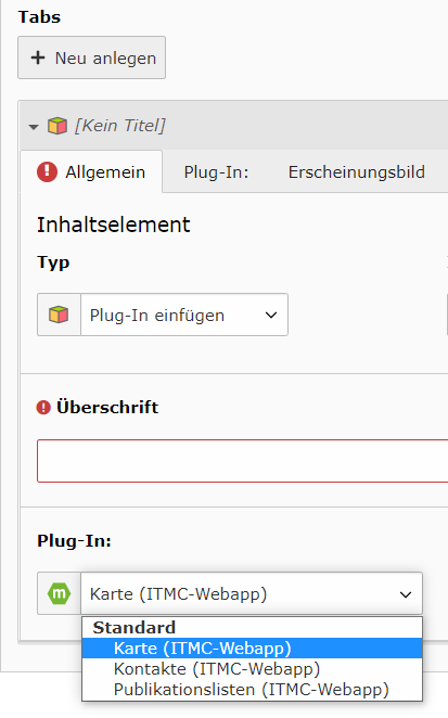
Content elements like text or text with image can be filled directly after the selection, for plug-ins you have to define the type of the plug-in in the second step.
Possible content elements
Currently, the following content elements can be used in tabs. Here extensions are planned and partly already in work.
- Text
- Text in two columns
- Text and image on the left
- Text and image on the right
- Statistics tiles
- Text tiles
- Image tiles
- Responsive tables
- Plug-ins
- Contacts webapp
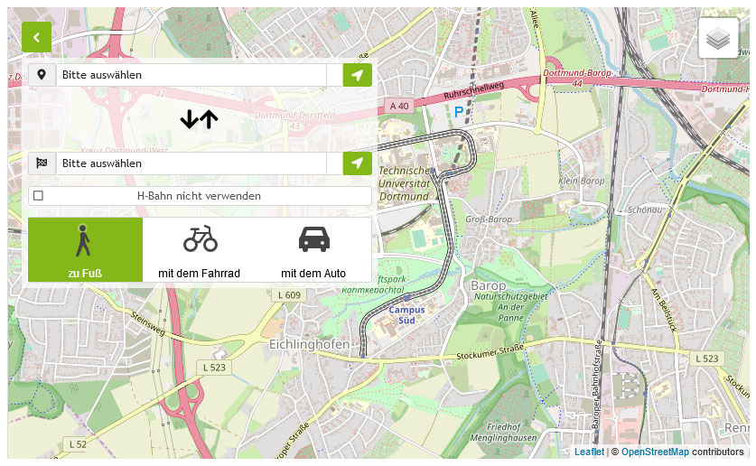
- Maps webapp
- Publication lists webapp

