
Responsive tables
Responsive tables adapt to the respective screen width so that the content can always be read optimally on the respective end device.
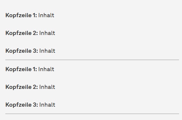
On large screens (e.g. desktop PCs), the tables are displayed as usual. On small screens (e.g. smartphones), the individual cells are positioned one below the other and the headings of the header row or header column are repeated in each cell. This ensures correct allocation of the content.
In order for a responsive table to be displayed correctly on small screens, the header row or header column must be correctly labeled. The individual steps are described in the next section.

How is a responsive table integrated?
Tables with only one header row or header column:
Include the "responsive table" content element. Create the table in the rich text editor and fill it with content. Important: Do not use connected cells, otherwise the responsive table will not be displayed correctly.
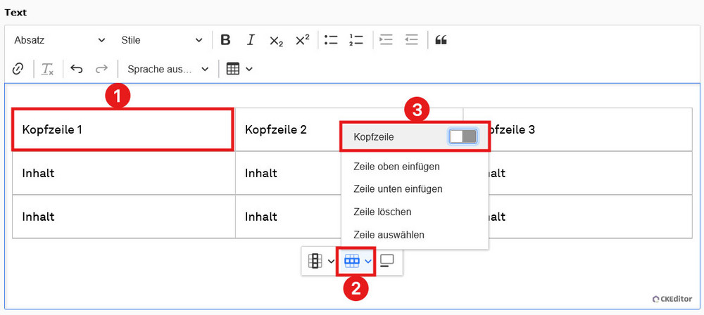
Finally, draw either a header row or a header column. We will describe the steps using the header row as an example.
Click in any cell of the future header row. In the context menu at the edge of the table, there are the menu items "Column" and "Row". Click on "Row" and then on the first entry "Header row" in the submenu (see screenshot "Mark up header row").
The header is now marked up and is highlighted in bold in the backend and frontend. You can now save and close the content element.
If you want to undo the highlighting, simply repeat the steps. Click on the "Header" entry again to remove the highlighting.
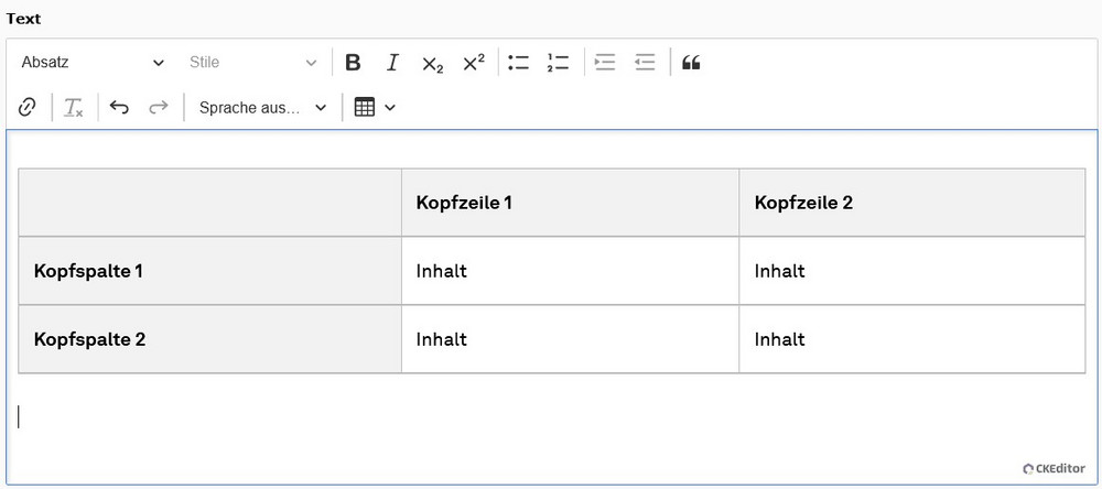
Tables with header row and header column:
Create the table as described above and draw a header row and a header column.
The first cell of the table must remain empty in this variant so that the table is displayed correctly on small screen widths (see screenshot "Table with header row and header column").
Common errors
Connected cells
Connected cells must not be used in responsive tables, otherwise display errors will occur.
Multiple header rows / header columns
Marking more than one header row or header column leads to display errors. Only one header row and header column may be marked per table.